How-To Schedule Content Using Faceb...
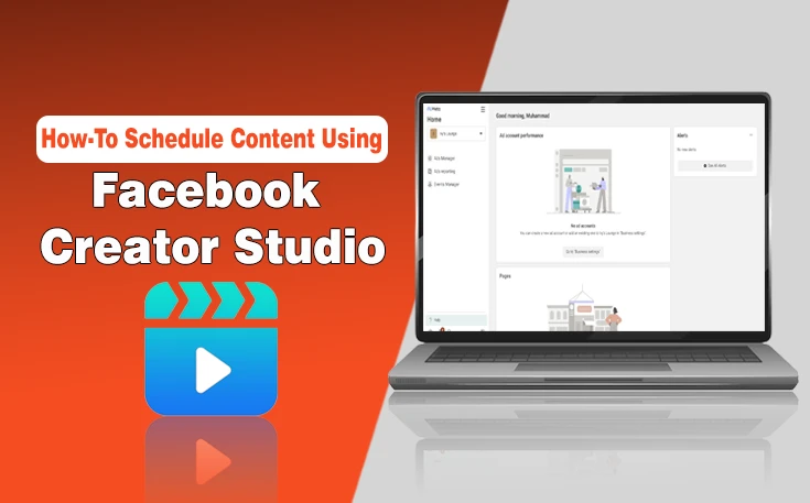
Facebook Creator Studio has changed to Meta Business Suite. You can now schedule, manage, and monito...
Read More


WebTechSolution has been a game-changer for our business. Their expertise in SEO and social media marketing helped us reach new customers and significantly boosted our online presence. Highly recommend their professional services!

Working with WebTechSolution was an amazing experience. Their team delivered outstanding results through personalized digital marketing strategies. Our traffic and engagement have increased, and we couldn’t be happier with the outcome!

The team at WebTechSolution is incredibly knowledgeable and efficient. They helped us refine our marketing approach, resulting in more leads and better conversion rates. They truly care about delivering real results. A great investment for any business!


Facebook Creator Studio has changed to Meta Business Suite. You can now schedule, manage, and monito...
Read MoreFor an online business in Malta, the only thing that comes first to mind is Blogs. A better user int...
Read MoreHave you ever encountered a “403 Forbidden Error” while browsing the Internet? Recently,...
Read More