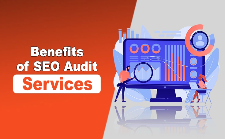
Top Benefits of SEO Audit Services ...
Let’s face it – SEO is not what it used to be. It is no longer just about keywords, backlink...
Read More


WebTechSolution has been a game-changer for our business. Their expertise in SEO and social media marketing helped us reach new customers and significantly boosted our online presence. Highly recommend their professional services!

Working with WebTechSolution was an amazing experience. Their team delivered outstanding results through personalized digital marketing strategies. Our traffic and engagement have increased, and we couldn’t be happier with the outcome!

The team at WebTechSolution is incredibly knowledgeable and efficient. They helped us refine our marketing approach, resulting in more leads and better conversion rates. They truly care about delivering real results. A great investment for any business!


Let’s face it – SEO is not what it used to be. It is no longer just about keywords, backlink...
Read MoreThe marketing landscape is constantly evolving, with new trends and technologies always emerging. To...
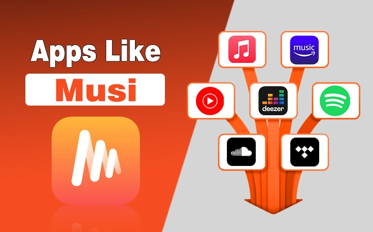
Read MoreNot getting enough from other music apps after the ban of Musi? Well, the reasons may vary as it cou...
Read More