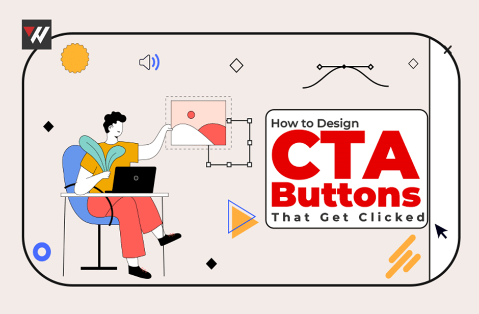
Whether you want to increase conversions, sign-ups, or sales, the style and positioning of your CTA buttons may make or break your campaign. CTA buttons serve as the driving force behind encouraging users to take the desired action on your website or landing page. They should be visually appealing, easily noticeable, and compelling enough to prompt immediate action from your target audience. Optimizing the placement and language of your CTA buttons can significantly impact the overall success of your digital marketing efforts.
This blog post contains the ideas and techniques for creating CTA buttons that force users to click on them and grab their attention.
Tips to Design Appealing CTA Buttons
The Key Is clarity
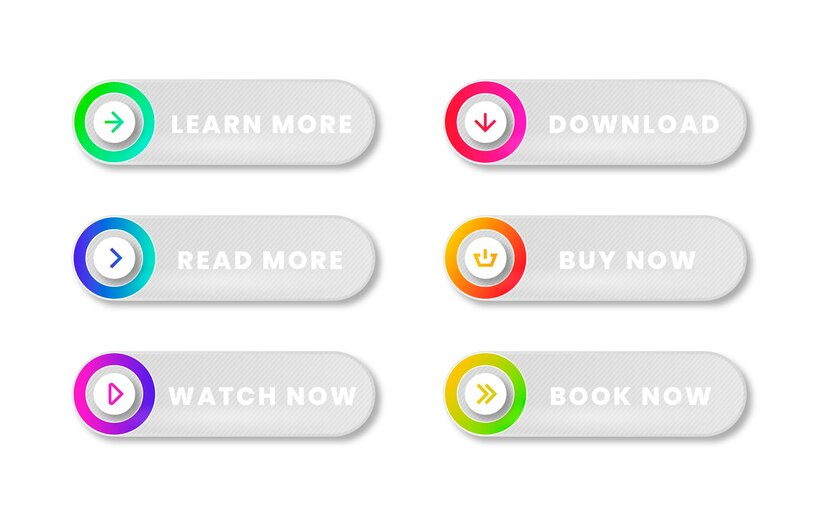
The first and most important aspect of a great CTA button is clarity. What will happen when clicking the button should be immediately apparent to your visitors. Verify that the button’s wording is precise and focused on taking action. Make sure your verbs are forceful, unambiguous, and devoid of any doubt. Instead of “Learn More,” try “Get Started” or “Buy Now.” Using solid and direct language in your CTA button can create a sense of urgency and encourage visitors to take immediate action. Consider incorporating specific details or benefits to entice your audience, such as “Start your free trial” or “Unlock exclusive access.”
Differing Colors
Your web page’s CTA buttons should be easily noticeable, and one crucial way to do this is by using appealing colors. The button’s color should stand out from the backdrop, making it difficult to ignore. It is essential to take the psychology of color into account while marketing. For example, green and blue are relaxing and frequently utilized in CTAs that foster trust, but orange and red are commonly linked with urgency. When choosing colors for your CTA buttons, it’s essential to consider your target audience and the emotions you want to evoke. It’s worth noting that color preferences can vary across cultures, so researching your specific demographic can help ensure the effectiveness of your CTAs.
Read Also: How to Build a Website with Wix in 2024?
Size Counts
The CTA button should be prominent and manageable. It should be sufficiently large so desktop and mobile users can easily click on it. Ensure it is the right size to attract attention while maintaining the other page material. The size of the CTA button should be proportional to the surrounding elements and text on the page. This will help maintain a visually balanced design and enhance the user experience by guiding their focus towards the desired action. We can further optimize the button’s size for easy interaction by considering factors such as finger size for mobile users.
White Area
Your CTA button’s surrounding area, commonly called “white space” or “negative space,” is equally crucial. The button is given enough breathing room and is kept apart from other page components by enough white space. This increases the visibility of the control and reduces the likelihood of users unintentionally clicking anything else. White or negative space also helps create a sense of balance and organization on the page. It allows the CTA button to stand out and grab the user’s attention, making it more likely for them to take the desired action. White space can contribute to a clean and minimalist design, enhancing the user experience.
Persuasive Writing
The language for the CTA button should be convincing, in addition to being transparent and concise. Make use of language that speaks to the user’s wants and feelings. “Start Saving Today” is, for example, more appealing than “Open Account.” To increase the persuasiveness of your call to action, use persuasive strategies, including exclusivity, scarcity, and urgency. Exclusivity can be achieved using phrases like “Limited Time Offer” or “Exclusive Access.” By creating a sense of lack, such as mentioning limited quantities or availability, users will feel a more vital need to take action. Incorporating urgency into the CTA language, such as “Don’t Miss Out” or “Act Now,” can motivate users to click and engage with your call to action.
Testing A/B
One effective method for improving your CTA buttons is A/B testing. By developing two or more versions of your CTA and testing them with your target audience, you can gain data on which design and text combinations perform best. Make ongoing adjustments to your CTAs in light of the outcomes of these tests. A/B testing allows you to identify the most compelling CTA that resonates with your audience, leading to higher conversion rates. It is essential to track and analyze the data collected from these tests to make informed decisions for optimizing your CTAs in the future.
Flexible on Mobile Devices
Nowadays, a large percentage of website traffic comes from mobile devices; therefore, ensuring your CTA buttons work on mobile devices is crucial. Ensure your buttons fit properly on multiple screen sizes and are simple to tap with a thumb or finger. Use responsive design to ensure your website adapts seamlessly to different mobile devices. This will provide a user-friendly experience and increase the chances of visitors engaging with your CTA buttons. Furthermore, regularly testing your website on various mobile devices can help identify any issues and optimize the overall mobile responsiveness of your site.
Reasonable Alignment
Your text should flow logically where your CTA buttons are placed. They usually function best after a section or an informative and engaging statement. If the content supports it, you may also experiment with strategically positioning CTAs across the page. Use “sticky” or “floating” call-to-actions (CTAs) that follow visitors as they navigate the website. This can help ensure that your CTAs are always visible and easily accessible, increasing the chances of conversion. Consider using contrasting colors or eye-catching designs for your CTAs to make them stand out and grab the attention of your visitors.
Social Evidence
Incorporating social proof into your CTA buttons might increase their efficacy. Consider using symbols or numbers that signify credibility or popularity, such as “As Featured in Forbes” or “Join 10,000+ Satisfied Customers.” These social proof elements can help build trust and confidence in your audience, ultimately encouraging them to take action. By showcasing positive experiences and recognition from reputable sources, you provide evidence of your product or service’s value and reliability.
Availability
Last, your CTA buttons must be accessible to all users, including those with impairments. Ensure you can easily browse them using keyboard shortcuts, screen readers, and other assistive devices. Adding alt text to button pictures is one approach to improve the accessibility of your call to action. Another way to improve the accessibility of your call-to-action buttons is by providing precise and concise instructions or labels that describe the activity or purpose of the controller. This can help impaired users understand the button’s functionality and act appropriately. Regularly testing and reviewing the accessibility of your CTA buttons can help identify any potential issues and ensure a seamless user experience for all users.
Conclusion
CTA button design that is clickable is a blend of art and science. It necessitates a thorough grasp of user psychology, visual design principles, and constant testing and optimization. You can design CTA buttons that not only grab your audience’s attention but also motivate them to take the desired action, ultimately boosting the effectiveness of your digital marketing campaigns by emphasizing clarity, contrast, size, persuasive copy, A/B testing, mobile responsiveness, logical placement, social proof, and accessibility. Understanding the target audience’s behavior and preferences is crucial in designing CTA buttons.