


Mobile-friendly user experience (UX) design is now essential for the success of any website. With mobile devices replacing desktop computers as the primary means of internet access, it is more important than ever to provide customers with a fast, reliable, and stress-free journey. Our lives depend on mobile devices in the digital world. Mobile user experience (UX) plays an important role in our technology interactions, whether we’re shopping online, browsing, or utilizing apps. This blog highlights mobile UX design principles and how they affect user enjoyment, engagement, and success.
Understanding Mobile UX
Mobile UX design focuses on creating an enjoyable and efficient experience for users on smartphones and tablets. Unlike desktop or web interfaces, mobile devices have limited screen real estate, touch-based inputs, and varying network conditions. To address these challenges and ensure a seamless mobile UX, designers should adhere to these core principles:
Responsiveness
Mobile UX starts with responsive design. Websites and apps must function well across screen sizes and orientations. Content is optimized via a responsive layout, reducing zooming and horizontal scrolling.
Google also considers mobile responsiveness when ranking websites, making it essential for SEO.
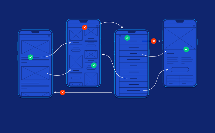
Easy Navigation
Effortless navigation is important for mobile UX. Users should find what they need easily. A well-organized menu, clear labels, and easy search functions improve the user experience.
The ‘hamburger’ menu, which reveals navigation options with a simple tap, is a popular choice for mobile design.
Fast Loading Speed
Mobile users are often on the go and expect websites and apps to load quickly. Slow-loading pages can lead to frustration and high bounce rates. Designers must optimize images, use efficient coding practices, and minimize external requests to ensure snappy performance. Google’s PageSpeed Insights tool can help identify areas for improvement.
Touch-Friendly Design

Given the absence of a mouse and keyboard, mobile design must prioritize touch-friendly elements. Buttons and interactive elements should be appropriately sized and spaced to prevent accidental taps or misfires. Furthermore, designers should consider users with various levels of dexterity and accommodate their needs.
Consistency Across Platforms
For brand recognition and user trust, consistency across platforms (iOS, Android, web) is essential. Platform-specific design elements may be needed, but key features and functionality should stay constant to give consumers a familiar experience.
Readable Typography
Mobile devices have different screen and font sizes, making text readability important. Designers should utilize legible fonts, proper font sizes, and proper text-background contrast. In addition, responsive typefaces improve readability depending on screen size.
Streamlined Forms
Mobile forms should be concise and user-friendly. Minimize the number of required fields and use input masks and validation cues to assist users. Leveraging input types like email, number, and date can also optimize the mobile form-filling experience.
Reduce Data Input
Mobile UX designers should minimize data entry because typing is challenging. Auto-complete, autofill, and predictive text improve user experience and reduce dissatisfaction.
Gesture-Based Interactions

Mobile devices use swiping, pinching, and tapping. To improve app and website navigation, these actions should be clear and used wisely.
Feedback and Error Handling
Effective feedback is vital for mobile UX. Users should receive clear confirmation when actions are taken, and error messages should be informative and guide users toward resolution. Well-designed micro-interactions can provide instant feedback, enhancing user engagement.
Conclusion
Mobile UX design is essential for effective websites and apps. Designers may give mobile customers a smooth, engaging, and efficient experience by following these guidelines. Prioritizing mobile UX increases user pleasure and engagement and boosts SEO results, making it a win-win for users and businesses online. The mobile world is ever-changing, thus your approach to design must adapt as well. Maintain your advantage by focusing on your users, remaining flexible, and constantly developing something new.
FAQs
What is mobile UX design?
User Experience on Mobile Designing mobile interfaces and interactions for smartphones and tablets focuses on ease of use. It entails developing layouts, navigation, and interactions for mobile devices’ particular restrictions.
Why is Mobile UX Design Important?
Mobile devices are the main way to access digital content and services, making mobile UX design essential. Well-designed mobile UX helps users connect with websites and apps on smaller screens, improving user pleasure, engagement, and business results.
How does responsive web design affect mobile UX?
Responsive web design optimizes website performance on mobile devices and other screen sizes. It improves mobile UX by minimizing needless zooming and scrolling, giving users the same and amazing experience across devices.
How to Speed Up Mobile Website or App Loading?
To improve the loading speed of a mobile website or app, consider optimizing images, minimizing external requests, and using efficient coding practices. Compress images, leverage browser caching, and enable content delivery networks (CDNs) to reduce load times. Test your website’s or app’s performance regularly with Google PageSpeed Insights.
Why Is Touch-Friendly Design Important in Mobile UX?
Touch-friendly design makes buttons and links large and well-spaced for touch motions. Mobile UX must eliminate inadvertent taps and deliver a seamless, frustration-free experience for touchscreen users.